Oz Realty is a property management company based in Toledo, Ohio. The company is a "sister company" to the well known "Ohio Cashflow".
Instructions:
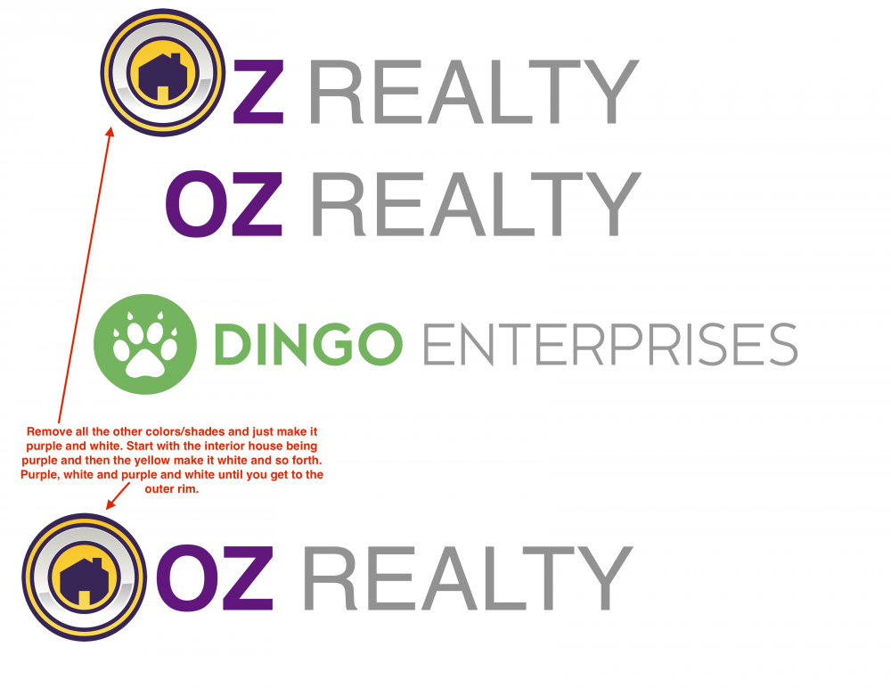
We would like for the Oz Realty logo to be be very similar to the Dingo Enterprises logo. Basic, clean and corporate looking. We would however like the color scheme to be purple (Please refer to the Michigan Cashflow logo for color matching. "Realty" can be in grey like "Enterprises" is. We can even try an orange color for the "Realty" to see how that would look). Please offer a few variations of the "O". As explained in the red note in the attached. Make the "O" with the house in it just purple and white. Please remove all other colors. I'd like to see the "O" containing the house logo and then the "O" separate and to the left of "Oz Realty" on it's own. Also, please give me options with all caps on OZ REALTY and with small caps "Oz Realty". Thanks
Preview
Graphic11555696143.png
Preview
TacoBell1555696601.jpg
Preview
2019042002465364108.png
akilis13 is selected as the contest finalist!5 years ago
48art is selected as the contest finalist!5 years ago
johana is selected as the contest finalist!5 years ago
Design Concepts Completed5 years ago
Open design concept stage had ended with 108 submissions from 26 designers. Go to DESIGNS tab to view all submissions.

 48art
48art
 johana
 akilis13
 denfransko
 jaize
jaize
 kunejo
 evdesign
 IrvanB
 my!dea
 HannaAnnisa
 J0s3Ph
 Mahrein
 samuraiXcreations
 Lavina
 ingepro
 marshall
 rief
rief
 art-design
 gogo
gogo
 asyqh
asyqh
 dibyo
dibyo
 CreativeKiller
 cintoko
 perf8symmetry
 blackcane
 bricton