IT consultant, higher end, complete and comprehensive solutions with a focus on Information Security and data management, digital transformation for business
IT consultant, higher end, complete and comprehensive solutions with a focus on Information Security and data management, digital transformation for business
Instructions:
I've had this name for many years, but never really been able to crystallize an actual logo for it, which is why I want to leave this as wide open as possible for your creative ideas. Also why I picked so many "example" logos, that caught my eye. I'd be open to a "mascot" type of logo if you can think of something (maybe a nerd and his dog?). I'm wide open to any creative ideas here...Have fun and go nuts with it! The business brand is conveyed somewhat via the name, but other ideas I have for the brand include "personal", "professional", "service", "old-fashioned" (possibly?), and "prestige" or "higher end" type archetypes. Please ask if you would like more guidance or want to spitball ideas. Thanks!
Reference Samples:
andrie is selected as the contest finalist!5 years ago
B
BT&T5 years ago
$15 participation tip awarded to #253 by nehel
B
BT&T5 years ago
$10 participation tip awarded to #155 by Marianne
B
BT&T5 years ago
$10 participation tip awarded to #248 by Greenlight
B
BT&T5 years ago
$5 participation tip awarded to #233 by andrie
B
BT&T5 years ago
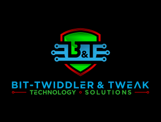
MASSIVE Thanks to all who made the final 5, and had soooo many great submissions. As much as I have enjoyed this process, I do need to get on with the actual running of the business now (I've been working this whole time, but need to get business cards, etc. and not having the logo was kind of holding me back). So, with that all in mind, I've chosen a winner, and it was not easy to do, however this designer was really on his game! He was the first to submit, and of all the submissions, was responsible for almost half. He was also very responsive, and fast turnarounds for any revisions. On top of all that, when I would ask for something, he would go above and beyond, and try to anticipate my direction(s) and come back with more than what I asked for almost every time. It was a very pleasant experience for me, and it's worth mentioning each of the 5 finalists exhibited this type of responsiveness, and it was really appreciated and didn't go unnoticed! I really wanted to give you all more of a tip, but this is a startup business, and I'm on a very tight budget, which was also one of the reasons I did the contest route. Lots of really great ideas, and I know I put a bit of the pressure on all of you to come up with something "great" without a lot of direction from me, as well you all rose to the challenge! So congratulations to "andrie", and I'll post just below some of the key reasons I felt this logo spoke to my (incohernet and color blind) vision, and why I feel it deserved a well-earned top prize in this contest!
(it is my hope maybe you all can learn something from this as well?)
B
BT&T5 years ago
ok so right off the bat, this was a very original and hopefully unique (like me!) design. But it started out somewhere very different, and while it ultimately ended up quite unique, there is the common anchor imagery of the shield (info/sec, protection). As you all (now) know, the colors do all mean something:
Blue - Digital Transformation
Red - InfoSec
Green - Education/Training. (keep these in mind when reading the explanations below)
Expanding on the shield/protecting idea, the red (danger) is "outside" the shield, showing the inside of the shield is being protected from the big bad red threats outside the protection of BT&T.
Inside the Big "B", there is a little (green) "t" (for "twiddler"), which is also looks like a KEY, (which rhymes with "t"? ok maybe that's stretching a bit. lol).
The blue area (Digital Transform) overlaps it all, and is reminiscent of a puzzle piece (because IT can be puzzling sometimes, especially if you're not educated/trained!), and also it defines and provides a path through the whole design (like a maze). To me this speaks to how my company can help navigate the maze that is IT. The little "spermy's" (as my one friend likes to call them...and yes he needs help!) are not very sperm-like in this (Compared to some of the other submissions, and you know who you are, and I apologize for my friend's sad obsession, totally not your fault!). But for me, those say "digital, electronics, circuits, etc." and are a welcomed flourish (as well as informing the puzzle piece idea?). On top of all this, it contains the BT&T (Bt&T actually, wich is technically the more grammatically accurate way to spell it, with the small t after the hyphen, so that worked out well too!). Is is cartoony perhaps? maybe, but so am I. Are there too many colors? perhaps, but they are there for a reason, and deliberately so. Plus it's fun and bright, which I think makes IT more friendly (conceptually, possibly on a subtle psychological level, or maybe I'm just reading too much into is and over analyzing?). Is it too complex? Hopefully. IT is VERY complex. So I think there is a lot going on in this design, some of which may not be readily apparent to the casual observer. I liked it. It "spoke" to me. I can't wait to see it on my business cards! Thanks everyone! And especially thanks to andrie!
B
BT&T5 years ago
P.S. wish I could have devoted more time to this process (work/life/adulting is hard, yo!). But I did have a lot of fun, and learned some things, and also explored many ideas about my business and brand, so thank you all so much for this amazing experience! :-)
Design Concepts Completed5 years ago
Open design concept stage had ended with 229 submissions from 13 designers. Go to DESIGNS tab to view all submissions.


 pencilhand
 nehel
nehel
 BlessedArt
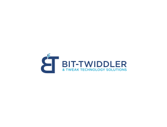
 Faridha™
 czars
czars
 ncep
ncep
 haidar
 jaize
jaize
 done
done
 Marianne
 mhala
mhala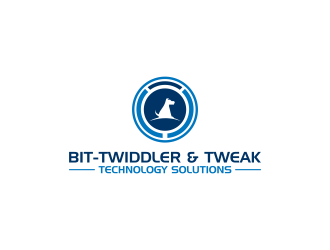
 RIANW
RIANW
$15 participation tip awarded to #253 by nehel