- $129
- BUDGET
- 66
- ENTRIES
BRIEF
DESIGNS (66)
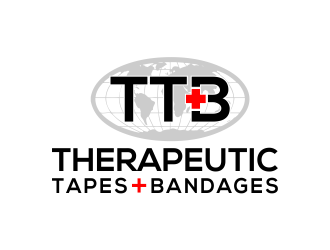
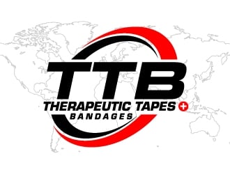
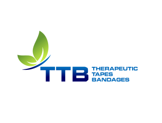
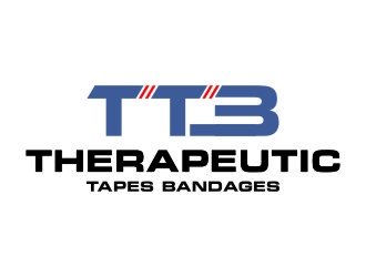
- Logo Name:
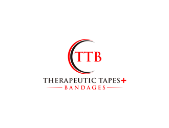
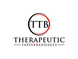
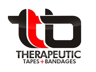
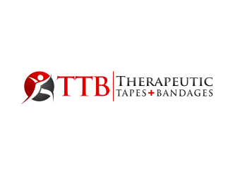
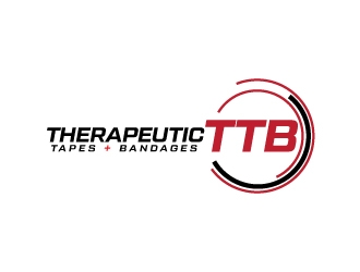
- Therapeutic Tapes Bandages (Logo must be TTB) (plus sign in red between Tapes and Bandages)
- Company Intro:
- Health care/medical products. Kinesiology tapes for sports professionals & sports enthusiasts and for the general population with soft tissue injuries, inflammation etc. Plus bandages for hospitals and clinics.
- Instructions:
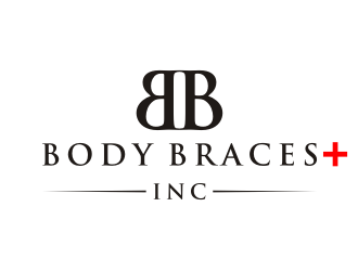
- White background; black font for name of business; TTB is our logo and MUST be prominent and in one batch of "samples" TTB must be in red and in another set TTB logo must be in black; red sign (as in Body Braces Inc in sample logo above) must be between Tapes and Bandages (i.e. Tapes Bandages) in our name which will be below the TTB logo. The name could be spread over 2 lines as it is long (as in Patinum Physiotherapy and Rehabilitation Group in sample above).
Reference Samples:


- CWaiting to hear from Karjen re changes I texted about 17 hrs ago for attempt #34 which is our #1 choice. Looking forward to finalizing this contest with Karjen after I get the minor changes in revised submission. MD.
- CThis is for designer Karjen. We love what he/she has done especially in #54. But we want a few changes. 1. Revise the world map. Attached is the outline of world map with different continents showed in outline only. The scan is very faint. Is it possible to do a similar map outline of the world instead of the globe you provided in your revised samples? If it's possible, the outline of the world map must be in faint but visible black outline against a white background. 2. The circled is a tiny bit too close to the S in Tapes. Please shift it out a tiny bit. The inside background within the circle appears to be a tiny bit tinted and not pure white. Is it possible to fix this? I guess the grey background of the world map may be causing this. 3. We would like a sharper resolution in the entire artwork. We are very happy with this draft and are very close to selecting this submission as the winner. How can I pick Karjen as the finalist and continue to fine tune it with above changes? Many thanks Karjen. Greatly appreciate your efforts. MD.
Open design concept stage had ended with 66 submissions from 17 designers. Go to DESIGNS tab to view all submissions.
- CPlease give me details/info about the brand design contest. How it works? Where do I go to see submissions? This is new to me so pls walk me thru the basic steps and procedure. Thanks. MD.
- CWhat happens next regarding the logo? Art work etc.?? MD.
- CHOW DO i FIND THE LOGO PACKAGE THAT HAS BEEN UPLOADED? md.
- CHi, We have had a few emergencies to deal with recently and hence have been delayed in uploading the brand contest. I expect to have the requirements uploaded in the next few days. Thank you. MD.