- $198
- CUSTOM
- 237
- ENTRIES
BRIEF
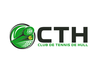
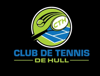
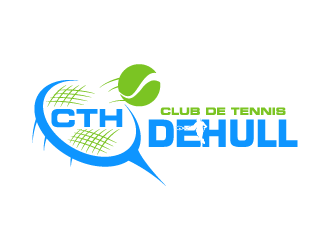
DESIGNS (237)
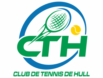
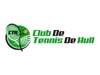
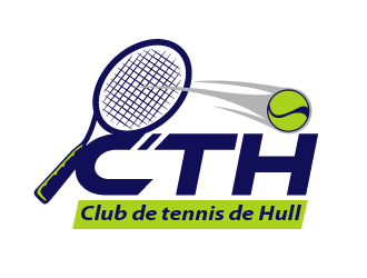
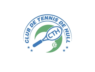
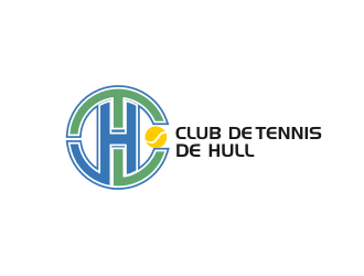
- Logo Name:
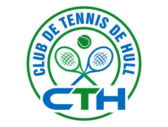
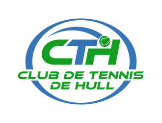
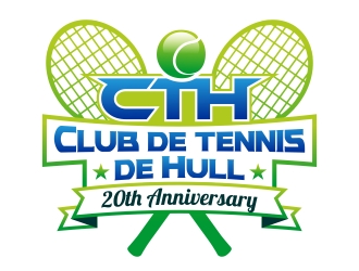
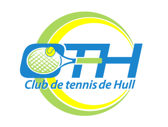
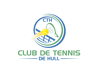
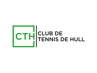
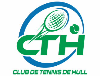
- Club de tennis de Hull (CTH)
- Company Intro:
- We are a tennis club in Gatineau, QC (Canada). This year, we celebrate our 20th anniversary, so we want to update and modernize our 20 years old logo!
- Instructions:
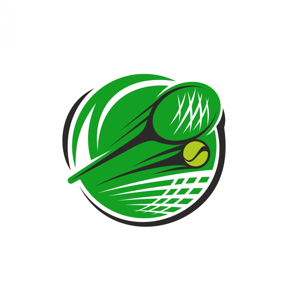
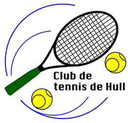
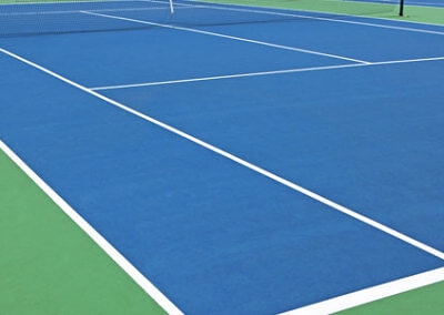
- The main idea would be to modernize our existing logo by keeping some graphical elements from the original one attached. We would like to keep a tennis racquet and maybe one tennis ball, with some kind of swing movement or ball movement. However, these elements can be completely redesigned and shuffled (it doesn't need to keep their original position, angle, etc.). As long as the overall look of the logo is "circular". New elements could be added like a tennis net or court. Optionally, one of these elements could be designed to facilitate the addition of the acronym "CTH" (for example, in the string of the racquet, in a tennis net, etc.). The point is that we don't want the full name to be IN the logo, but outside of it (under or on the right). So, when we want to put the logo on a website, business card or T-shirt, we could include the full name or not (being separated). The logo needs to be clean and lean (not too busy and complex). I've attached an example of a logo we found online, where it has the "circular" look we want with similar elements but has too many zig-zags (the criss-cross lines, etc.) and is too green. The main colors should be blue and green (like the modern tennis courts, see attachment) with some white background if needed. It's OK if there is one yellow tennis ball and some black contours if necessary. However, it has to be easily visible and readable when we print or put on a t-shirt (even as a monochrome version). Finally, we are open to a completely NEW graphical design, or one that is based around "CTH". But, it's just that we think it's easier to use the old one as a base, although honestly, it was pretty boring! Thank you! Yanick Aubé P.S. Note that the text is in french and "Hull" is the name of the city borough... The text can be on one line or two: "Club de tennis" on one, "de Hull" on the other.
Reference Samples:


Open design concept stage had ended with 237 submissions from 15 designers. Go to DESIGNS tab to view all submissions.