Natural skincare, spa, herbal and crystal products for a unisex audience, though mostly bought by women. All handmade. Targeted predominantly at adults.
Natural skincare, spa, herbal and crystal products for a unisex audience, though mostly bought by women. All handmade. Targeted predominantly at adults.
Instructions:
My brand is inspired by a need to go back to more natural things - ie, to kick the chemicals and revert to tried and tested methods... with a little bit of hedge witch, crystal healing, mystical and magical influence.
The logo needs to appeal predominantly to women, without being so feminine that it turns off male customers. Target age group is mostly adult women with a reasonable disposable income and an interest in natural skincare, and the brand itself is about accessible luxury pampering products.
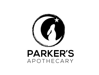
Parker's should be more prominent than Apothecary. Please note that there should be an apostrophe in Parker's, for some reason it didn't get accepted into the logo/company name field!
Rabbits and celestial bodies are important imagery for me. I have attached here an image that resonates with me: a crescent moon with a rabbit silhouette. This is something I would like to have incorporated into the logo, with possibly a star or three in the crescent arc. Please don't directly trace the image though; it's someone else's wonderful art and I would not like to steal their work. The moon could be crescent or full, please feel free to interpret it in your own way!
Brand colors are black with accents of Pantone (solid matte) 206M; please be sure to include the Pantone shade! Simple is good, but additional colours are fine if you feel they are necessary; I'm a fan of teal and grey, but open to suggestions. It will be used on a white background.
As this will be used on packaging, the logo needs to be flexible enough to be shrunk down to fit on something the size of a lipbalm tube - or even smaller! - and still be legible.
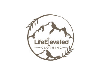
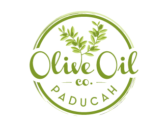
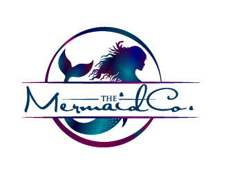
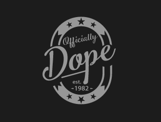
As my 'liked' logos suggest I like the idea of a round logo, but I'm not stuck on it; the design elements of the chosen samples appealed to me equally, if not more than, their shape.
Please do not suggest a text-only logo.
Thank you very much for your time!
Reference Samples:
joran705 is selected as the contest finalist!7 years ago
aisya is selected as the contest finalist!7 years ago
DPNKR is selected as the contest finalist!7 years ago
Design Concepts Completed7 years ago
Open design concept stage had ended with 1 submissions from 1 designers. Go to DESIGNS tab to view all submissions.

 DPNKR
DPNKR