I like our current logo but it doesn't transfer well when monochromatic. I want a logo design to use in black and white that is not a big jump from our current logo since we will continue to use the existing color logo
Preview
3facebookcover1502304650.jpg
Preview
businesscardback1502304690.jpg
Preview
black1502304702.png
Reference Samples:
C
Client513347 years ago
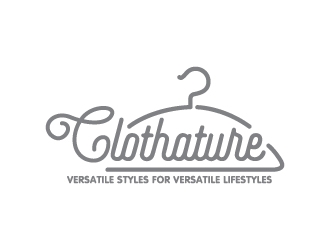
Thanks to all that have submitted. For clarification: I am looking for a logo that separates the words Clothez and Exchange so it can be easily read and understood in black and white.
C
Client513347 years ago
Thank you all for working on the design. We have decided that we want to use the C hanger separately from the name Clothez Exchange. Unless someone can make the C hanger somehow fit better the make the full word "Clothez". We feel like the eye is drawn to "lothez" rather than "Clothez" in our existing logo
Remember that the design must be similar to the existing logo but clear to read in black and white.
REDCROW is selected as the contest finalist!7 years ago
maseru is selected as the contest finalist!7 years ago
arenug is selected as the contest finalist!7 years ago
C
Client513347 years ago
Thank you all for your work on this contest. Such great talent. Wish you all the best.
sanworks7 years ago
thanks for all the feedback and scoring,but one question to u...do u really know what u want?because i asked u many times that what is your needs..and u told us that u need the similar design as previous logo u have already just to clear the font right?i just check every ones design and see that every one did the same logo u have ...even u write it on the discussion area that u are looking for a logo that separates the words and must be similar to the existing logo...beside that i didn't mean that the finalist designer are not cool...they really did a great job and their design is very beautiful..but why u misguided us...if u didn't do that then the rest of the designers can design something fresh and unique ...pls make sure what u want and then assist us,so that is helpful for our works and specially our time ...thanks ,have a good day..
Design Concepts Completed7 years ago
Open design concept stage had ended with 1 submissions from 1 designers. Go to DESIGNS tab to view all submissions.
Yes sanworks, I can see how you would feel that way. We were not interested in making a large change in our logo. RedCrow surprised us all with another option that we were not expecting. However, when all the logo designs were presented, we just felt the winning logo was a solid design and perfect fit. We apologize that the communication fell short and will remember your comments for the future. Thank you for your hard work and best of luck to you in the future.
 thanks for all the feedback and scoring,but one question to u...do u really know what u want?because i asked u many times that what is your needs..and u told us that u need the similar design as previous logo u have already just to clear the font right?i just check every ones design and see that every one did the same logo u have ...even u write it on the discussion area that u are looking for a logo that separates the words and must be similar to the existing logo...beside that i didn't mean that the finalist designer are not cool...they really did a great job and their design is very beautiful..but why u misguided us...if u didn't do that then the rest of the designers can design something fresh and unique ...pls make sure what u want and then assist us,so that is helpful for our works and specially our time ...thanks ,have a good day..
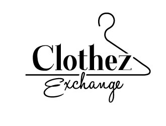
 REDCROW

