- $129
- BUDGET
- 1
- ENTRIES
BRIEF
DESIGNS (1)
- Logo Name:
- Tamlin Exteriors
- Company Intro:
- Tamlin Exteriors is a Roofing and storm restoration company. Specializing in Roofing, Siding, Gutters, and insurance storm restoration.
- Instructions:
- I would like it to be transparent and also have a white or silver border around it to allow it to be on both dark and light backgrounds. I want "Tamlin" to be the main emphasis, and maybe even capitalized. I would like "Exteriors" to be smaller and not the main focus. And I would like some effect within the logo, maybe just text borders to give it depth. But I also want to keep in mind it will be used on website, but as well as shirts, so it needs to be easily converted to an embroidery type design as well. <br><br>My current logo is located at TamlinExteriors.com and It is just simple and boring. I do not necessarily need a house or similar type logo, if you have a better idea from the logos i chose i liked. I like the one I have provided below as a reference. I like that it could be used with the house or without the house as just normal text for different applications.<br><br>I just dont want it to be clip art-ish. Or just have clip art above texted. IMO that is something i could get for $5 on fiverr.com<br><br> Please feel free to be creative.
Reference Samples:




- TI still would like more of the logo that I included as the Carlton Roofing design. Most are closer to what I already have on my site currently. Something outside of the box of a normal or simple clipart roofing logo.
- TI have selected finalist. Jaize, you said you have some revisions to post already. And for PakNton and moomoo, I commented on your finalist logo for small revisions. Thank you.
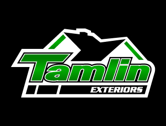
- Tjaize , I took your image and made some alterations to show you to make it easier.
1. I made the "T" taller and wider on the top left, but also made it shorter on the top right.
2. Made less bars on the bottom.
3. Went around the entire image and altered the white space and images so that everything has a uniform amount of space and everything matches up correctly.
Attention to detail to make sure everything looks right and flows. I moved alot of stuff and hard to keep track off. But if you can look over everything so that everything seems to have the same amount of white space, but also everything like the roof edges line up to eachother... - TJaize, I did that because its easier. But I am not an artist and that is far from a perfect resolution or professional image. but if you can pay attention to the small things it will look a lot better
Open design concept stage had ended with 1 submissions from 1 designers. Go to DESIGNS tab to view all submissions.
- THi Jaize, Please see my message and respond here. Or please add me on skype - degenorate. I added you. Then I will confirm package. Thank you so much.
- TCould you also add me to skype when you get a chance - degenorate. I would like an easy way to get in touch with you and to see some examples of other work for future projects. Thank you very much. This turned out great. I look forward to using you again.
- TAlso, can you please comment and tell me the two fonts you used for this logo?


