Clever Little Maker is a 1-man company that specializes in product design, engineering, and micro-manufacturing. I use a combination of digital design techniques and computerized manufacturing technology on a micro-scale to create clever and *useful* products from wood, metal, and composites. EDIT: I consider myself to be a "Digital Craftsman" - using Digital tools to create products with a craftsman-like quality (I hope that helps)
Clever Little Maker is a 1-man company that specializes in product design, engineering, and micro-manufacturing. I use a combination of digital design techniques and computerized manufacturing technology on a micro-scale to create clever and *useful* products from wood, metal, and composites. EDIT: I consider myself to be a "Digital Craftsman" - using Digital tools to create products with a craftsman-like quality (I hope that helps)
Instructions:
I would like the design to reflect my philosophy of DIY, Digital Tools, Creativity & Innovation, and "Maker" culture. I prefer logos that are clean with a circular motif so we can stamp or burn our logo into our products and include our website URL (cleverlittlemaker.com) in text encircling the logo itself. I had a vague idea of incorporating a tool or two (such as a hammer, screwdriver, etc.) in the logo, but that is not a requirement. I prefer the name (or initials "C L M") be incorporated within the logo (as opposed to below it or next to it) but that is not a requirement either. I don't want to put too many restrictions on the design as I'm pretty open to ideas and want to see what creative ideas you can bring me.
Reference Samples:
C
Client461647 years ago
Dear logo designers,
Some really great work! I am really impressed with almost all of the submissions so far.
Looking over the submissions is helping me hone in on what I like stylistically. So here are a couple suggestions:
1) I definitely prefer simple coloration (i.e. not gradients) with bold outlining.
2) I like "industrial" fonts (less "bubbly").
3) I like clever imagery melded into the logo. (stylized "CLM" doesn't seem to work for as far as I can tell so far..)
Here's a couple ideas that were sparked by designs already submitted. (if you wish to explore them - I am not sure if they will work or not):
"Steampunk" aesthetics and perhaps a gnome ("steampunk gnome"?) I know that's really kinda vague, but I'm thinking "Gnomes are tiny little people that are often depicted as craftspeople, and "steampunk" is kind of an anachronistic melding of Victorian art with technology..." so would kind of thematically fit with what I do (sort of).
This is a sample of Mike Mignola's artwork. I like the bold, angular ink style. I think it would (potentially) look good for a "steampunk gnome" mascot in the logo
C
Client461647 years ago
Note: I think Mike Mignola's STYLE would work well, not the exact image I uploaded (please don't put his chimp in the logo! :)
C
Client461647 years ago
Note to designers: I apologize for slowness in rating and commenting. 48hourslogo's website is giving me lots of errors/very slow loading... I appreciate your patience.
gogo is selected as the contest finalist!7 years ago
scriotx is selected as the contest finalist!7 years ago
torresace is selected as the contest finalist!7 years ago
C
Client461647 years ago
Thank you to all 3 finalists for working so hard and producing such awesome logos! I am in the process of selecting the winner and it is quite difficult to make a choice since all of the final entries are of such high quality...
Design Concepts Completed7 years ago
Open design concept stage had ended with 1 submissions from 1 designers. Go to DESIGNS tab to view all submissions.

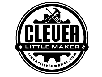
 scriotx
Some really great work! I am really impressed with almost all of the submissions so far.
Looking over the submissions is helping me hone in on what I like stylistically. So here are a couple suggestions:
1) I definitely prefer simple coloration (i.e. not gradients) with bold outlining.
2) I like "industrial" fonts (less "bubbly").
3) I like clever imagery melded into the logo. (stylized "CLM" doesn't seem to work for as far as I can tell so far..)
Here's a couple ideas that were sparked by designs already submitted. (if you wish to explore them - I am not sure if they will work or not):
"Steampunk" aesthetics and perhaps a gnome ("steampunk gnome"?) I know that's really kinda vague, but I'm thinking "Gnomes are tiny little people that are often depicted as craftspeople, and "steampunk" is kind of an anachronistic melding of Victorian art with technology..." so would kind of thematically fit with what I do (sort of).
Some inspiration imagery:
https://www.pinterest.com/pin/380694974728136814/
https://steampunkcostume.com/2011/04/26/steampunk-garden-gnome/
http://scattered-shards.wikia.com/wiki/File:1200x960_18370_Gnome_Artificer_2d_fantasy_dwarf_steampunk_gnome_picture_image_digital_art.jpg