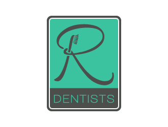
We are father and son opening a new clinic- Dr. Ratras- hence R Dentists.
Instructions:
We like the colour, design, and font of the one we are working on. We just want someone to make the ribbon smoother then it currently is. We are working with a graphic designer who doesn't seem to understand the consistency in taper we would like. the thinnest portions of the r should match the other thin portions of the r and the thickest portions of the r should match the other thick portions of the r. If someone could just provide a nice ribbon like effect with fluidity then we would be happy. We are aesthetic dentists hence the details matter. We also find the brush a bit thick so a little thinner would be nice
Preview
201609240141020.png
Reference Samples:
jaize is selected as the contest finalist!8 years ago
Ayana is selected as the contest finalist!8 years ago
gotam is selected as the contest finalist!8 years ago
C
Client442418 years ago
#53 by gotam is the winner. I would like the exact same brush that he drew in black but in the original writing of mine.
C
Client442418 years ago
*same font of DENTISTS as the original.
Design Concepts Completed8 years ago
Open design concept stage had ended with 1 submissions from 1 designers. Go to DESIGNS tab to view all submissions.
 jaize
jaize