Antonius Apotheke is the name of my pharmacy. The patron of the pharmacy is St.Antonius. It is a well established, traditional pharmacy, that dates around the 1900s. Nevertheless, I would like to create a modern, elegant logo.<br>I DO NOT WANT A 1:1 COPY OF THE LOGOS BELOW! THESE ARE JUST FOR INSPIRATION!<br>
Antonius Apotheke is the name of my pharmacy. The patron of the pharmacy is St.Antonius. It is a well established, traditional pharmacy, that dates around the 1900s. Nevertheless, I would like to create a modern, elegant logo.<br>I DO NOT WANT A 1:1 COPY OF THE LOGOS BELOW! THESE ARE JUST FOR INSPIRATION!<br>
Instructions:
I would like a logo which includes mainly red and white, maybe blue as well. I would like a look that is not too pompous, but rather simple and elegant. I will post some examples of other pharmacies underneath to give you an idea.
Preview
2016081115023124853.jpg
Preview
2016081115105424853.jpg
Reference Samples:
edesigners is selected as the contest finalist!8 years ago
D
Draganj8 years ago
This is for logogeek. Lets go in this direction, try to work with this layout in mind.
D
Draganj8 years ago
this is for edisigners. i played around a bit, this is roighly what i meant. maybe you can do better.
D
Draganj8 years ago
I love the ginkgo leaf. it is one of the oldest medicines in the world. it is also an excellent motif for a logo. i like this pencil-drawing style for Ginkgo
check
https://s-media-cache-ak0.pinimg.com/236x/eb/81/0f/eb810f8eca82b9e787894794178fdc58.jpg
D
Draganj8 years ago
This is for Joseph.
Maybe a layout similar to this one. You can change the font, size of letters, colors etc.
J0s3Ph8 years ago
Thanks for that. I will revise the logo like that.
thanks
D
Draganj8 years ago
For eDesigners - please try something with this layout. I would like the letter "T" to be more recognizable, but still be part of the tree
D
Draganj8 years ago
The "T" should be more recognizable. Something like this. Please make one version like this and one with your fine-tuning. thank you
D
Draganj8 years ago
This is what i want. a slight hint of a curve on top and thats it!
Design Concepts Completed8 years ago
Open design concept stage had ended with 1 submissions from 1 designers. Go to DESIGNS tab to view all submissions.


 Thanks for that. I will revise the logo like that.
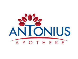
 Webphixo
