We are a photography studio (VENUE) that rents out our unique space to professional photographers and media productions. We have a 138yr old studio located in downtown Houston. <br>www.thehoustonstudio.com
We are a photography studio (VENUE) that rents out our unique space to professional photographers and media productions. We have a 138yr old studio located in downtown Houston. <br>www.thehoustonstudio.com
Instructions:
For this brand we would like to stick with simple coloring. Currently we use black/white and a baby blue. We are not opposed to lightening the main colors to black on white rather than white/blue on black. We like symmetry and are open to an incorporated logo, yet we have no idea what of. Also, we are a fan of capital lettering. No script. We prefer to keep the logo/branding masculine. Also prefer to not have too much 3D/dimension as this will be a watermark as well.
Preview
201605110546040.jpg
Preview
2016051304381142197.jpg
Reference Samples:
M
Mindiraser8 years ago
I have always liked the idea of the two words running as one and separated by color.
I like the implementation of the colors and the idea of the white background as long as there is some color as well.
M
Mindiraser8 years ago
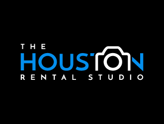
Is it possible to have a version that incorporates "The Houston Rental Studio"?
We are dealing with some legal naming issues and may be going that direction. Great work so far!
M
Mindiraser8 years ago
I am a big fan of composition of number #31 and the implementation of the camera "hump" on #35. Possibly combing the two...maybe the camera hump on the second "O" in Houston.
Or maintaining the composition of the #31 design but changing the "H" logo into a squared camera designed logo?
M
Mindiraser8 years ago
I added a camera photo. If there were a creative way to incorporate some of the higher rated designs with a squared off logo that was creative and looked similar to that camera (unbranded), it would be a deal breaker.
akilis13 is selected as the contest finalist!8 years ago
pakderisher is selected as the contest finalist!8 years ago
jaize is selected as the contest finalist!8 years ago
M
Mindiraser8 years ago
I like the inverted camera...
Design Concepts Completed8 years ago
Open design concept stage had ended with 1 submissions from 1 designers. Go to DESIGNS tab to view all submissions.


 akilis13

I like the implementation of the colors and the idea of the white background as long as there is some color as well.