- $129
- BUDGET
- 1
- ENTRIES
BRIEF
DESIGNS (1)
- Logo Name:
- My Sister In Laws' Kitchen
- Company Intro:
- This logo is for a client. The logo will be for a food blog with two sisters. One sister has a focus of Paleo diets and gluten free recipes while the other all is all about cookies, breads, and such. There is very much a yin and yang or polar opposites to their approach.
- Instructions:
- I've attached some color palettes that reflect the feel they are going for. Other color schemes are welcome so long as they reflect a food blog with a feminine touch. They've expressed wanting to see some type of contrast expressed in the logo to represent themselves individually. As far as graphics are concerned, I'm sure typical kitchen items would work. I thought that it might be fun to show two women back to back (like a charlie's angles pose) holding mixing bowls or something. Also thought it might be fun to see kitchen utensils replace different letters in either the word, "Kitchen," or some other word depending on how the logo is laid out. The client seems to be very particular about what they want, but don't know how to express or articulate what they are thinking. I would anticipate revisions.
Reference Samples:



 Thanks the entries everyone! I'm going to get with the client for feedback and move forward.
 Hi everyone! Just got feedback from the client and they expressed wanting to see more emphasis on a the yin yang idea. They said, "I was really hoping to see something that had a circle shape with a salad on one half and a cookie on the other half and site name to the right." As of right now, the client prefers these designs: #9 by jhay, #7 by smartdigitex, #3 by karjen. Client prefers the Blue/Green colors and likes the scheme used by #2 by edesigners. Lastly, they expressed how much they liked seeing kitchen utensils make up the letters in the word "Kitchen".
 Also - they said the name needs a slight correction to: "My Sister in Law's Kitchen" (singular possessive)"
 Logo Concept
Open design concept stage had ended with 1 submissions from 1 designers. Go to DESIGNS tab to view all submissions.
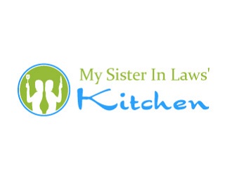
 Thank you to all the designers on this project and for entertaining the many different ideas for revisions!


