Floorball ACT manages the representative Canberra Chargers (men's) and Canberra Chargettes (women's) floorball (please Google floorball!) sports teams that play in competitions and tournaments against other club teams in Australia and sometimes internationally. We are now seeking a well designed logo to represent the club and teams.<br><br>- Not many people know floorball. It's a growing sport in Australia and we want the logo to impress and "catch the eye".<br>- The target market is aimed at sportier people and is generally between 18-35 years... but all ages play.<br>- Please note that these are amateur sports teams and our committee are volunteers. All players pay to play, not the other way around. Our budget is therefore not huge.
Floorball ACT manages the representative Canberra Chargers (men's) and Canberra Chargettes (women's) floorball (please Google floorball!) sports teams that play in competitions and tournaments against other club teams in Australia and sometimes internationally. We are now seeking a well designed logo to represent the club and teams.<br><br>- Not many people know floorball. It's a growing sport in Australia and we want the logo to impress and "catch the eye".<br>- The target market is aimed at sportier people and is generally between 18-35 years... but all ages play.<br>- Please note that these are amateur sports teams and our committee are volunteers. All players pay to play, not the other way around. Our budget is therefore not huge.
Instructions:
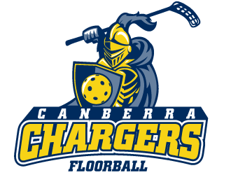
Floorball ACT are looking for a logo to represent the already established men’s (Canberra Chargers) and women’s (Canberra Chargettes) floorball team names. In the Google document available here: https://docs.google.com/document/d/160PTNgzmTZKMUyGCcKNjOP_OgsHY0nF-AY4Mbji2RuQ/edit?usp=sharing information and images are compiled to provide inspiration and guidance around what we are looking for in a logo. <br><br>The logo for the men’s and women’s teams should be the same apart from the stylised text saying ‘Chargers’ for the men and ‘Chargettes’ for the women respectively. <br><br>Please go through this document, look at the logo images contained herein and the design elements desired as well as our jersey design and colours and get creative in producing a high quality logo for us that meets the brief to win the prize on offer!<br><br>We have a short very short timeframe for finalising the logo design and putting it on our jerseys by mid next week so we will therefore look very kindly on any logos submitted within 48 hours and looking to finalise early next week (by 22 March)!<br><br>Design elements desired:<br>- Stylised text: which can equally say ‘Canberra Chargers’ or ‘Canberra Chargettes’ respectively. The inclusion of ‘Floorball’ as minor text is optional. If differentiated ‘Canberra’ should be above/before and smaller than the team name ‘Chargers’ or ‘Chargettes.’ The text shows the team name, where they are from and possibly the sport they represent and is therefore a very important design element.<br>- Armoured helmeted figure: the armoured and helmeted figure (possibly with a coloured cape) is the Canberra Charger/Chargette floorball player. The figure should be asexual so it can equally be used for the men’s and women’s teams. The full helmet and full covering of armour and maybe cape should do this (i.e. a face, bulging muscles or long/short hair etc should not be included as this implies the sex of the character). The armour also gives the image of a strong defence, an important element of floorball.<br>- Sword/lance preferably stylised as a floorball stick: it’s important that the logo is recognisable as a logo for the sport of floorball and the floorball stick element is unique to floorball. The sword/lance should point forward, up or diagonally forward and be held by the armoured figure as if on the charge/attacking or intimidating. If stylised as a floorball stick the head/blade of the floorball stick should be at the pointy end of the sword/lance. The sword/lance element represents a strong attack/offence and skilful play, other important elements of floorball.<br>- Shield, possibly stylised like a floorball ball: it’s important that the logo is recognisable as a logo for the sport of floorball and the floorball ball (whiffle ball) element is unique to floorball. This may include a round shape, the inclusion of dimples or smaller circle patterning as per a floorball or alternatively the ‘CC’ stylised lettering to represent Canberra Chargers/Chargettes. The shield element should either be held by the armoured character or enclose/background/foreground the logo (see all these ways in above examples). The shield again represents a strong defence but also skilful play and blocking, more important elements of floorball. The shield symbology is also common to a lot of logos in sport and elsewhere.<br>- Charging horse: This element would be great to include but can be considered optional. It can become difficult to include all these elements in a clean logo but should be achievable. The charging horse represents speed and agility, more important elements of playing floorball. The horse should be showing forward movement as if charging/running (see examples above) as opposed to being stationary. The horse should look a bit intimidating but not ‘angry.’<br>- Colours: shades of blue, yellow and white could be employed successfully as per the team jersey colours or darker /lighter variants. Grey/silver type colours may also be employed successfully for armour and possibly text. Consideration should be given to the use of colours as per examples above as well as how the logo might appear on blue, yellow and white backgrounds. The outlining effects common to sports logos in the above examples should be utilised rather than solid block colours. The jerseys will be sublimated so consideration should be given to the choice of colours achievable there (shiny metallic colours don’t work but this effect can be achieved by gradients and shading effects).<br><br>Another excerpt from the briefing document:<br>• Below are a collection of examples. The floorball act logo should use a combination of the horse and fully armoured (but asexual) Charger figure riding the horse. A shield can be included (possibly in the round shape of a floorball), and the floorball stick pointing forward and maybe a little upwards should represent the Charger’s sword or lance. Stylised text should be included underneath this character that can equally well read ‘Canberra Chargers’ or ‘Canberra Chargettes’ for the men’s or women’s teams respectively. The text ‘Floorball’ could also be included in smaller stylised text or as an option below or after the other text. <br>• In some of the examples below, the shades of blue, yellow and white colours used look good. Consideration needs to be given to how any logo looks on a base of blue, yellow and white for the jerseys (see our jersey design towards the end of this document).<br>• The various examples of the writing of ‘Chargers’ in the following logos look good and should provide inspiration. Consideration needs to be given to having the ability to write ‘Chargettes’ on the women’s logo for the women’s shirts in the same text and a similar space.<br>• Elements of lightning shapes/design in the horse or any other element could work as long as not tacky but they are not necessary. <br>• The shield element could be a round/circular shape as per a floorball with whiffle ball design elements or a ‘CC’ stylised symbol (think Canberra Cavalry).<br><br><br>Be creative and have fun. Thanks in advance for your submissions, very much looking forward to seeing them and having a logo!
Preview
2016031706575640805.png
Preview
2016031713161640805.jpg
Reference Samples:
S
speldie8 years ago
GiuMagnani is just invited to join this contest!
MarkindDesign is selected as the contest finalist!8 years ago
memphis17 is selected as the contest finalist!8 years ago
Design Concepts Completed8 years ago
Open design concept stage had ended with 1 submissions from 1 designers. Go to DESIGNS tab to view all submissions.
A huge thank you to all the designers for their time and efforts in the logo contest! Some really good designs but in the end there could only be one winner. Congratulations scriotx, your logos were our favourite!
S
speldie8 years ago
$5 participation tip awarded to #26 by MarkindDesign


 scriotx

GiuMagnani is just invited to join this contest!