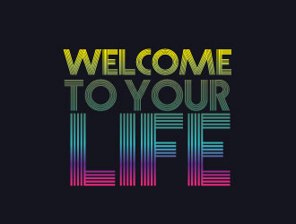
WELCOME TO YOUR LIFE is a DJ residency in NYC that centers on electronic and pop/new-wave music from the 1980s to the 2010s, including earlier electronic sounds from composers such as Craig Leon, et.al. The location of the residency is an upmarket wine bar that caters to the NYC theatre scene, and its clientele knows well and/or experienced the heyday of new wave and pop within the context of electronic and dance music. The vibe is about slow building (sometimes but not always downtempo), often minimalist, and frequently dreamy sounds ... through which echoes bits of the pop and dance music (think, New Order; The Smiths; Siouxsie; The Cure; Depeche Mode; et.al.) that reminds, revisits, echoes, and re-instates the relationship these sounds can have and evoke.<br><br>
WELCOME TO YOUR LIFE is a DJ residency in NYC that centers on electronic and pop/new-wave music from the 1980s to the 2010s, including earlier electronic sounds from composers such as Craig Leon, et.al. The location of the residency is an upmarket wine bar that caters to the NYC theatre scene, and its clientele knows well and/or experienced the heyday of new wave and pop within the context of electronic and dance music. The vibe is about slow building (sometimes but not always downtempo), often minimalist, and frequently dreamy sounds ... through which echoes bits of the pop and dance music (think, New Order; The Smiths; Siouxsie; The Cure; Depeche Mode; et.al.) that reminds, revisits, echoes, and re-instates the relationship these sounds can have and evoke.<br><br>
Instructions:
I want this logo to feel rooted in the new wave/pop/dance aesthetics of the 1980s, especially. The concept of the residency is that the music selected ties together the sounds and feelings that run through pop and dance in each decade: 1980s, 1990s, 2000s, 2010s. <br><br>This re-listing, while taking into account all the excellent work of the designers who've have a look already, is really meant to skew away from the darker/rainbow-oriented material and explore a more minimalist/new-wave influence. It shouldn't look like a New Order album cover! But the aesthetic is relevant. I'm drawn in particularly to clock imagery (see the image example below). But I'm not confined to it.
Preview
2015101523265534718.jpg
Preview
2015101523144434718.png
Preview
2015101523192334718.jpg
Reference Samples:
D
DJDALKESH9 years ago
Love the progression of colors. Could imagine a text-block WELCOME TO YOUR LIFE with a similar chromatic flow.
D
DJDALKESH9 years ago
akilis13 is just invited to join this contest!
D
DJDALKESH9 years ago
abss is just invited to join this contest!
#16 by IjVb.UnO is selected as the contest finalist!9 years ago
#47 by pakderisher is selected as the contest finalist!9 years ago
#6 by litera is selected as the contest finalist!9 years ago
#67 by fornarel is selected as the contest finalist!9 years ago
#26 by J0s3Ph is selected as the contest finalist!9 years ago
Design Concepts Completed8 years ago
Open design concept stage had ended with 1 submissions from 1 designers. Go to DESIGNS tab to view all submissions.
 litera