We are a group of researchers, professionals, graduate students and organisms interested in elite sport research. Our mission is the advancement of knowledge in elite sport via knowledge sharing between our members. We are structured around 4 axes : Intervention, Physiology, Biomechanics and Neuropsychology.
We are a group of researchers, professionals, graduate students and organisms interested in elite sport research. Our mission is the advancement of knowledge in elite sport via knowledge sharing between our members. We are structured around 4 axes : Intervention, Physiology, Biomechanics and Neuropsychology.
Instructions:
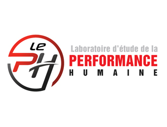
Our name is<br>Laboratoire d’étude de la performance humaine<br><br>and our acronym is<br>LePH<br><br>We want a logo with these specifications :<br>- The logo must be designed around our acronym (the four letters LePH) and have a square-ish aspect ratio; the full name can be written besides or under with a matching font, but must be separated from the "true" logo so we can remove it when needed<br> ( e.g. LePH | Laboratoire d’étude de la performance humaine ).<br>- Emphasis must be on the letters PH (stand for Human Performance) and not on Le (stand for Research Laboratory). Le and PH may be separated or not, but ideally PH must be in a bigger font.<br>- The logo must represent the high dynamics of elite sport, with vivid colors and design, but must not identify to one sport or another (eg. avoid a running silhouette, or a basket ball, etc. )<br>- The logo must stay relatively simple so that it could be recognized even on small sizes.<br>- We’d like to also have a version in black&white or greyscale, so that the logo is clear when printed.
Reference Samples:
#10 by logopond is selected as the contest finalist!9 years ago
C
chenier.felix9 years ago
Hello all, thank you all for your very interesting contributions. The contest winner is Logopond. Thanks again for your participation !
C
chenier.felix9 years ago
Hello Logopond. Here are the alterations we need to your submission.
1. Please combine the logo from #10 with the text from #4, as pictured in the attachment. Maybe the dark grey of "PERFORMANCE" should be changed to black to match the logo, and the light grey of "Laboratoire d'étude de la" may be darkened a bit too.
2. In the text, could you change the case of the 'E's in "Laboratoire d'étude de la" so that it is indeed a minus e and not a small capital E.
3. In the text, "PERFORMANCE" is not aligned with the rest on the right. Could you fix it ?
4. Also in the text, "HUMAINE" seems slightly off on the left.
5. Could you reduce very slightly the size of the minus e in "Le" in the logo ? So it looks more minus.
6. Is it possible to have also a full-black version for printing, as pictured in the attachment ?
7. If you don't mind, is it also possible to have a full-white version for printing on a dark background ?
C
chenier.felix9 years ago
What I mean by combining logos 10 and 4
C
chenier.felix9 years ago
What I mean by full black version.
Design Concepts Completed9 years ago
Open design concept stage had ended with 1 submissions from 1 designers. Go to DESIGNS tab to view all submissions.


 logopond