
For those of us who are not as artistically inclined, it can be hard to know, or describe what it is you want for your logo. This article will serve as a guide to help you work with logo designers and get a logo that you like, and represents your brand.
3 basic logo variety
Logos come in 3 general varieties. Each variety has its strengths and its weaknesses.
Brandmark
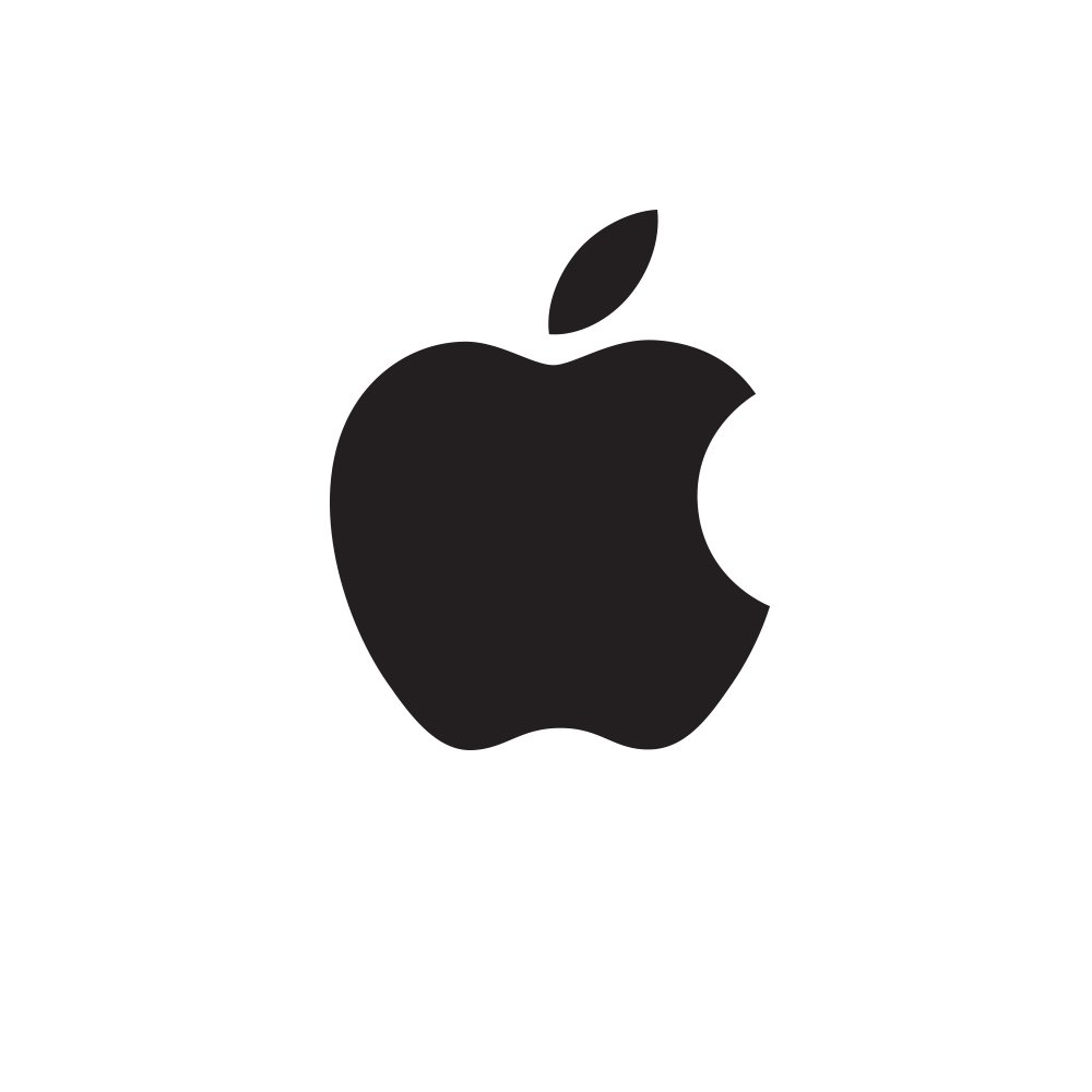
The first type of logo is the Brandmark. This is like Apple’s apple, or Nike’s swoosh. A symbol without text. These types of logos are great because they appeal on an emotional level, and they are instantly recognizable. People can ascribe whatever feelings they have to the logo and form an emotional bond to the company. The downfall with Brandmarks is that to promote your Brandmark it is often very expensive and takes a lot of time to get your icon recognizable. People can recognize the swoosh or the apple because those symbols are on virtually all of the respective companies products and advertisements.

Wordmark
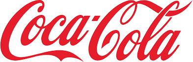
The next type of logo is the Wordmark. Companies like Coca-Cola, and Google use text logos. A stylized text is effective in that it says your company name, and there is a level of personality that goes into the text, and it helps to build name recognition. The downfall is that it takes more time to read than looking at a brandmark, and people have a difficult time attaching meaning to a word, because words often already have set meanings. You can read a more in depth article on wordmarks here.
![]()
Combination Mark
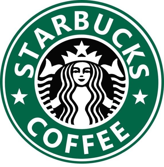
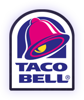
The final type of logo is a hybrid between the brandmark and the wordmark. This is known as a Combination Mark. Starbucks and Taco Bell are good examples of this. There is a small logo, but there is also the company name attached to it. This is good if you are trying to grow your logo to the point where it can be a represented by a standalone brandmark, which both Starbucks and Taco bell have done.
As a small business owner with a limited advertising budget, a combination mark will probably be your best bet. A recognizable yet simple symbol accompanied with your business’s name can go a long way for your money, and if one day your business becomes big enough, you can move on to a brandmark.
Design your logo to be special
Now the next part of creating a quality logo is communicating with your graphic designer. Think about what the message that you want to convey to the world is. It might be confusing for a construction company to have an animal mascot, so it is best to start off basic. Having a person question your logo can be counterproductive. The best logos give people an instant knowledge of what it is your business does. For example, take a look at this logo for Skarsgard.

What service do you think they provide? Straight to the point without a word. Just a picture. Take a look at this one:
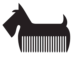
Tells you exactly what the business does.
Of course, these are amazing and extremely creative examples, but I think the point is clear. Make sure that your logo gives a hint as to what your business is, and tell your designer the emotion you want people to have when they think of your product. Do you want your brand to exude class? Convey reliability? Give a sense of fun? Telling your designer the attitude you wish to present through the logo can give the designer a good understanding of color, and the attitude on which they design the logo.
Examples of Poorly Designed Logos
Now, let us look at some examples of bad logos.
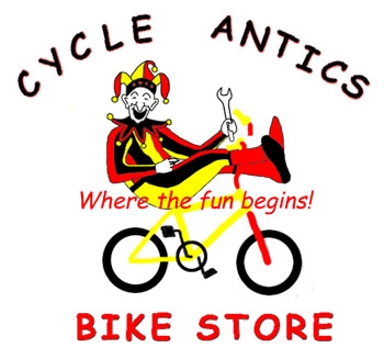
There is too much going on in this logo. The font is the ever dreaded comic sans. It is confusing the message. Is this a bike store for clowns? Some specialty bike store, or a regular bike store that for some reason has a clown. It makes the customer confused.
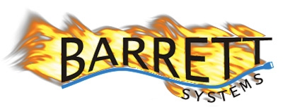
Aside from the poor graphics there was a good idea here, it was just executed poorly. This looks to be a company that provides internet systems for businesses, see the little computer cord that makes the underline of Barrett. I do not understand why the lettering is on fire. It is confusing. Maybe they install firewalls?
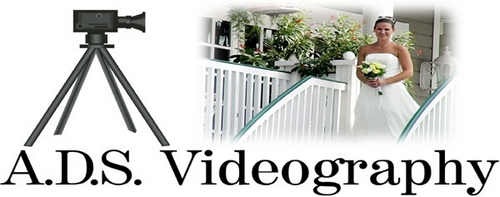
This wedding company logo gets right to the point. They make videos of weddings. However, it is unappealing for a few reasons. The first is that there is a cartoon camera, and a real picture of a bride. Pick one or the other. I also think that there is too much going on. There logo could have been reduced to the small figurines on the wedding cake, and the customer would know exactly that the videography is primarily intended for weddings.
Last Thoughts
Hopefully now you know what to ask of your designer, and have a better understanding of the type of logo you would like to represent your business. For some ideas on what you could potentially have your logo look like, you can always visit our gallery for some inspirational guidance.