Pros4Nonprofits is an online directory of local businesses who want to provide services to local nonprofit organizations. Nonprofits can connect with business owners through the directory and solicit them for services. The Mission of Pros4Nonprofits is to support nonprofit organizations by providing them with powerful tools that help them get the best available local services that help them search for the best available local service providers, including reviews from other nonprofits.
Pros4Nonprofits is an online directory of local businesses who want to provide services to local nonprofit organizations. Nonprofits can connect with business owners through the directory and solicit them for services. The Mission of Pros4Nonprofits is to support nonprofit organizations by providing them with powerful tools that help them get the best available local services that help them search for the best available local service providers, including reviews from other nonprofits.
Instructions:
Ideas and Concepts:
The logo should symbolize the following:
1) Synergy between the nonprofit and business communities
2) Show forward progress, or "giving direction"
3) Navigating into the future, possibly use navigation or stars (the Stars represent that reviews are being provided -- best reviews are up to five stars.
Potential Color Choices:
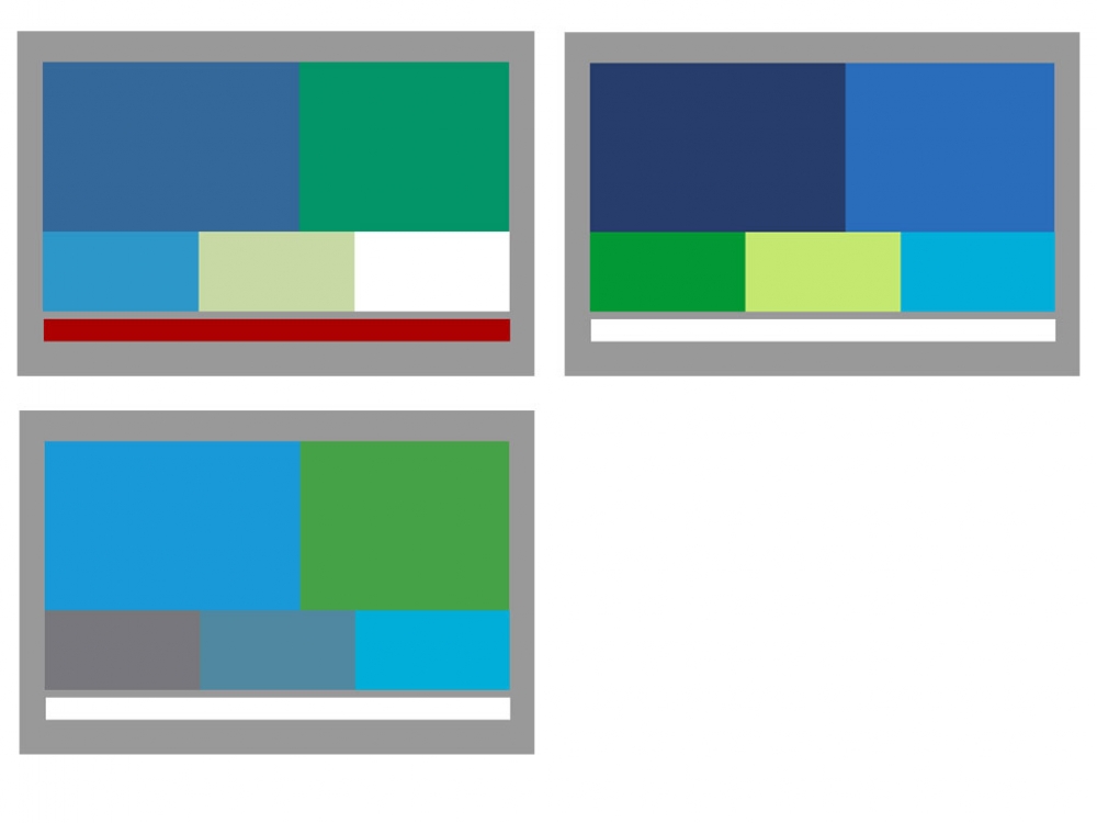
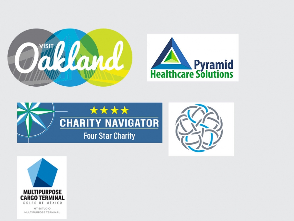
We would like to see a logo design with a soft blue, green and gray color scheme. The colors could potentially overlap like the Oakland logo in the examples, or work together like the Pyramid in Healthcare Solutions.
Preview
201506082120330.jpg
Preview
201506082121050.jpg
Reference Samples:
J
jenniferbailey9 years ago
I do not like anything with the image of people
J
jenniferbailey9 years ago
Overall we have some really good submissions. The client likes the blue/green interaction of colors in the font and the icon itself. He also likes bolder font types. He would like to see some more "stars" in the icons, and he wants the icons themselves to be to the left of the type, not above it.
#18 by wendeesigns is selected as the contest finalist!9 years ago
#57 by jones12 is selected as the contest finalist!9 years ago
#68 by graphica is selected as the contest finalist!9 years ago
J
jenniferbailey9 years ago
Comments from my client:
Like the Blue-Green interaction in the name. Do not like 3 different colors in name. Like the brighter
blue/green in second design, but not sure if it captures the soft/warm element we’ve been working
toward.
Prefer Upper-Lower Case better than ALL CAPS (unless the Upper-Lower Caps are used).
Would like the tagline to be the Charcoal Gray (or Black) and centered under name. Add hyphen to
Community-Minded
Would like the symbol/name size to be more equal – symbol should not dwarf name.
Definitely like the symbol on the side. Like the star. Don’t like the “motion star” (third design)
Would like some additional colors added to the star to represent the diversity of both the non-profit
and business communities. Have liked the gold/yellow/orange incorporated into some other
designs.
graphica9 years ago
any update ?
Design Concepts Completed9 years ago
Open design concept stage had ended with 1 submissions from 1 designers. Go to DESIGNS tab to view all submissions.

 any update ?
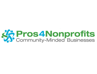
 wendeesigns