- $105
- CUSTOM
- 0
- ENTRIES
BRIEF
DESIGNS
- Logo Name:
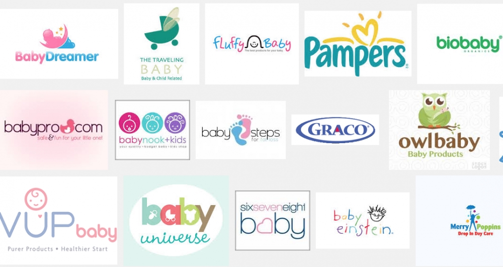
- The Organic Baby Diaries
- Company Intro:
- A social media/online resource for new mothers, expectant mothers and mothers who's been doing this "mom" thing for a while! We will publish everything from cute pictures of babies to really neat products for moms and their babies. Down the road, a website will be developed. The 'Organic' is simply a unique modifier for my name/brand and I will focus my page/brand around organic/healthy/good things for your baby.
- Instructions:
- I want YOU to design this logo and kick butt. Pick the colors that go with the "baby" industry. Light colors, pastels etc. It should be easy on the eyes and not have more than 3/4 different colors, one of which should be a white/grey/black. I would like the main lettering to be 'The Organic Baby' with the word "Diaries" somewhere underneath or to the side. In other words, we are THE ORGANIC BABY and Diaries is the modifier. Get creative, incorporate the 'Organic' aspect. I would like the logo to be simple enough and not too elaborate or intricate and if I were to put this logo on clothes, boxes or signage I was it to be easy to print.
- M
- M# 5 Feedback:
I love the idea/concept. I also live the font very much.
The design looks a little too modern/kids birthday place type of style.
Also, please try a few designs where you emphasize The "Organic Baby" Diaries (i.e. - organic baby).
I like the logo and the signage to the left - I see too many colors for my liking. - MLove*
- MI will review the designs shortly and move forward with the winners.
Open design concept stage had ended with 0 submissions from 0 designers. Go to DESIGNS tab to view all submissions.
I like the use of colors, the font is nice.
Edits:
Please utilize fonts to break up/emphasis the company name. Perhaps make "diaries" a different size/font/color than "the organic baby". You could also make "the" in "The Organic Baby" all lowercase in order to make things stand out.
I do not like how the baby is so intricate. Imagine if I had to get a metal sign created - It would be a pain to etch out that baby.