- $160
- CUSTOM
- 1
- ENTRIES
BRIEF
DESIGNS (1)
- Logo Name:
- Discovery Playtown
- Company Intro:
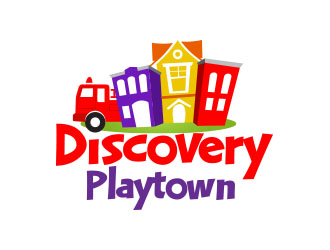
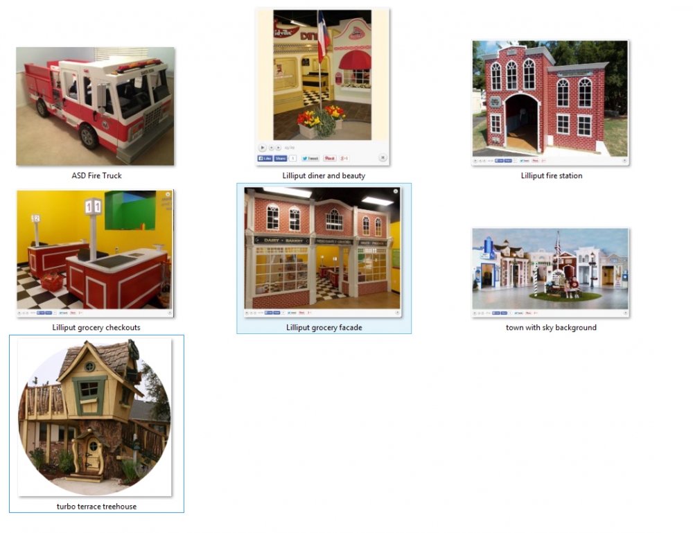
- Discovery Playtown will be an indoor playground and birthday party center focused on imaginative play. Our centerpiece will be a play town composed of a fire station with large play fire truck, large grocery store complete with checkout stands, beauty boutique, medical clinic, diner, and play house with kitchen and other home-style furniture along with “backyard” area. There will also be a large treehouse. The style will be most similar to that of a children’s museum. Themes we are going for with this logo: 1. Discovery 2. Imagination 3. Wonder 4. Fun
- Instructions:
- COLORS: purple, red, and yellow (like Q104 Cleveland: http://q104.cbslocal.com/) It’s very important that any logo has a color combination that is very easy to read from a distance. We are spending a pile of money on a custom exterior sign, and need to ensure it can be read from the highway across the parking lot from the storefront. LOGOS WE LIKE: http://www.discoverykidslv.org/ (I like the stars similar to Tinkerbell; also how the size of the lettering is varied) http://www.yelp.com/biz/peek-a-boo-playtown-franklin (I like the style and perspective of the buildings; although these are too tall … they should be more reminiscent of our actual structures; think very simplistic versions) http://madisonchildrensmuseum.org/ (another “town” design … but I don’t like the big sunburst or the weird red balls) http://s17.photobucket.com/user/nhrdesign/media/DO/KidsTown3rev_nhr.png.html (I like the first two) FONT: -We like this font: http://www.fontpark.net/en/font/lhf-happy-fun-ball-reg/# -If you have something similar that you think works better or should at least be considered. Any font used should be of a similar boldness to this. I want the lettering thick and very commercial-looking. -Please stick to basic solid lettering, avoiding use of outline or shadow. NOTE: We will be able to do only the letters for our exterior sign, so any graphic that goes with the logo would probably need to be separate; i.e. two different versions, if that makes sense. (Our sign will be the type where the letters are individual illuminated blocks, attached to a "raceway" behind. In the case of our logo, it needs to be stacked in two rows. ... or easily separable.
 #13pls
 Thanks for your submissions! We are reviewing and will be in touch shortly to pick our finalists.
 Thanks for the revisions!! We'll be in touch shortly.
Open design concept stage had ended with 1 submissions from 1 designers. Go to DESIGNS tab to view all submissions.

 Thank you everyone for your participation! Great job!

