Re-branding my wedding and event videography business that also does the occasional corporate job as well. As a one-man sole proprietor business, I personally work on every project that gets booked. My view on weddings is that they are part of the story of your life which deserve to be documented for futures generations to enjoy. Check out my current website at johnrosevideography.com to get an idea of what my work looks like if you need further inspiration.
Re-branding my wedding and event videography business that also does the occasional corporate job as well. As a one-man sole proprietor business, I personally work on every project that gets booked. My view on weddings is that they are part of the story of your life which deserve to be documented for futures generations to enjoy. Check out my current website at johnrosevideography.com to get an idea of what my work looks like if you need further inspiration.
Instructions:
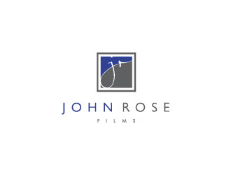
Looking for something stylish and modern that will look good on wedding videos, website, and business cards but also corporate video DVDs. Prefer not to have a rose, film reel, or aperture as part of logo. Film strip okay. I'd like the text to be separate from any kind of graphic element that you may use. Also, if you use my initials, I'd prefer for the R to not be lined up so that it seems to share the vertical side of the J. If they are spaced out more or are offset as in the example of the Simon Furlong logo as seen in the gallery, then I would lean more in that direction. Aside from that, open to anything really. Take a look at the gallery above for inspiration. Above all, have fun with it!
Reference Samples:
J
Johnny9 years ago
Hey all. Just a note, I'd prefer for the R to not be lined up on the same plane so that it seems to share the vertical side of the J.
J
Johnny9 years ago
I tend to be drawn to the Century Gothic font, but I'm also really digging the font in #5. Great work so far!
J
Johnny9 years ago
Some great designs coming in! Would like to see a few more ideas with a film strip being utilized somehow. Check out the submissions that were done for FilmStory.
J
Johnny9 years ago
You guys are awesome! The level of creativity I'm seeing is looking incredible. Keep up the great work!
pakderisher is selected as the contest finalist!9 years ago
sndezzo is selected as the contest finalist!9 years ago
karjen is selected as the contest finalist!9 years ago
J
Johnny9 years ago
Congratulations to the finalists! This was a REALLY tough call to make, and I wish that I was able to pick more people. Thank you everyone for your hard work though. I truly appreciate it!
Design Concepts Completed9 years ago
Open design concept stage had ended with 1 submissions from 1 designers. Go to DESIGNS tab to view all submissions.


 sndezzo