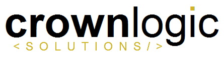
Online web design company. Crownlogic will be one word as shown. company acronym is CLS
Instructions:
crown symbol, we are leaning toward a flat/modern looking design (nothing too flashy), but feel free to explore other options. If you want to spell it out it is Crownlogic Solutions, if incorporating an initialism it is CLS.
We aren't too attached to anything at this point so feel free to explore.
Company url is crownlogicsolutions.com
Update:
Things to try:
* see example image below for general feel for text
* try putting a crown (should be masculine) on top of the 'c'
* try replacing the 'i' in logic with a chesspiece
* try creating a cool graphic of CLS to go along with the basic text below
* example: CLS in the shape of a crown would be cool
Preview
2015020200064631506.png
Reference Samples:
C
caseygimbel9 years ago
Thanks for the entries. I have some general feedback based on what I've seen that I'll list here and then I'll give individual feedback to each entry. These are looking good so far, keep it up!
C
caseygimbel9 years ago
I think text all uppercase with an interesting font like #3 or all lowercase is the best. Don't mix case, even drop caps/small caps isn't that great. It bothers me that the C is larger than the rest of the letters. I think all lowercase could add something to it as the lowercase 'g' and the dot on the 'i' can add character to the logo
C
caseygimbel9 years ago
I like making solutions small as it is less important than crownlogic. #3, #4, #9 are best examples of this. Even if we make crownlogic all lowercase, solutions may still look interesting in all uppercase with a spread kerning like in #3 or #4, try it both ways.
C
caseygimbel9 years ago
The more I see the initialism CLS included in the logo the more I don't really like it there. Unless CLS is being incorporated into the design like in #2 or #10 we should just leave CLS out entirely.
C
caseygimbel9 years ago
what about a chess piece? That would be a cool way of tying crown and logic together. A king chess piece? Can anyone make that work?
gipanuhotko is selected as the contest finalist!9 years ago
jaize is selected as the contest finalist!9 years ago
Alle28 is selected as the contest finalist!9 years ago
mybook.lagie9 years ago
Start your good luck, guys. I wish I can be one of you right now
Design Concepts Completed9 years ago
Open design concept stage had ended with 1 submissions from 1 designers. Go to DESIGNS tab to view all submissions.
 Start your good luck, guys. I wish I can be one of you right now
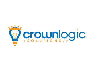
 gipanuhotko