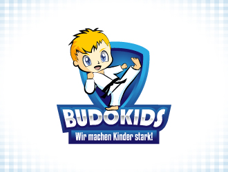
We need to redesign our current logo. The lettering "BUDOKIDS" must be highlighted. The lettering "Wir machen Kinder stark!" should be included as a slogan. In addition, the drawing of a kickin 'child should be introduced.
The logo should especially appeal to children and parents. It should be immediately clear what it's about: Kids Sports, Kids Martial Arts, age group 6-9 years.
We want to replace the current logo. The new logo should therefore have a corresponding recognition.
addendum (10.09.14 / 21:32 Central-Europe-Time):
An important part of the logo should be the graphic of a kickin 'child. This should not be drawn too narrow. It is to act cute and trustworthy. It will appeal to children and parents. As a style we prefer the anime style: large eyes, larger head, ... The figure is supposed to act at the same time dynamically.
The lettering "BUDOKIDS" to act fairly stable and thicker. In "Wir machen Kinder stark!" Pay attention to the correct spelling. Uppercase and lowercase letters are strongly mixed in German.
The logo is similar in style to those in the selected by us examples from the inspiration gallery.
Instructions:
Our Website: www.budokids.info
Preview
201409101517090.jpg
Reference Samples:
Design Concepts Completed10 years ago
Open design concept stage had ended with 1 submissions from 1 designers. Go to DESIGNS tab to view all submissions.


 Norsh
Norsh