- $200
- CUSTOM
- 1
- ENTRIES
BRIEF
DESIGNS (1)
- Logo Name:
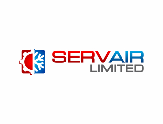
- Servair Limited
- Company Intro:
- A well established air conditioning and refrigeration company that does sales and repair of commercial & residential air conditioning units, equipment and parts. We do not do heating.
- Instructions:
- The logo is representing a strong established company. The word Servair can be split via colours into "Serv" and "air" (no space necessary) since it is commonly mistaken for another company called Servisair. Do include Servair Limited in the text. Can create a symbol to represent or air flow, "cool" or something similar. Nothing too wispy.
- A
- SThe design rated 5 stars incorporates a "parts" symbol as well as a "cooling" symbol. It represents what Servair does although it is so differeny from my existing logo. Bear this in mind as it is very important that the logo represents what the company stands for. We sell air conditioning units as well as parts. We do repairs for commercial & residential air conditioning / refrigeration equipment. Feel free to ask me questions. Great job so far designers :)
 pls see #62 thanks
- SDesigners, feel free to switch the wavy colours on the original logo to blue and play around with the red and blue from there. Air should be kept blue too I think. By all means don't feel limited to my suggestions.
- Sdesigners, separate SERV and AIR by using light and deep shades of same colour, make the word LIMITED smaller n less noticeable as the word is necessary but not as significant as SERVAIR. Try using different fonts and lets see what happens
- SIngepro,
Separate SERV from AIR with colour, make SERVAIR more significant, make LIMITED less on design #96 - SIngepro,
Do the same on design 91 and 93 - SDesigners, if you can incorporate red and blue as an option to your designs I would greatly appreciate that. Less than an hour to go, let's make this time count! Fantastic work thus far!
- SCongratulations to all the finalists! I look forward to working with you closely over the next few days. Please feel free to submit as many wildcard designs as you like, that way I can guide you in the right direction. Your challenge this round is to keep the colour red on the left and blue on the right. Still split SERVAIR into two colours as outlined previously. New symbols are encouraged. Thank you and keep up the great work !
- SDear Ingepro,
Are you available for some changes now? Open design concept stage had ended with 1 submissions from 1 designers. Go to DESIGNS tab to view all submissions.


Here are some helpful tips to get the most out of your design project:
1. Please leave feedback directly on the designs to guide the designers in the right direction
2. Eliminate designs that you are “not interested”
3. Please rate each design between 1 and 5 stars to help designers know your preference.
We want you to get the best possible design for your business. Thank you for choosing 48HoursLogo.com