- $129
- BUDGET
- 1
- ENTRIES
BRIEF
DESIGNS (1)
- Logo Name:
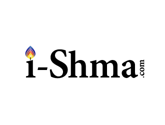
- i-Shema.com
- Company Intro:
- The word Shema means to hear and do in Hebrew. This is going to be a web site that brings many congregations together. So lots of people will be involved.
- Instructions:
- I want earthy colors and like the idea of the i being a small letter and the S being a capital. I can see a little feminine touch but easily read and bold enough to work on other print projects. I want NO symbols, just the letters of the word unique enough to remember them when you see them. Distinctive. IF there is any symbol at all - the little " i " might could be a person - not identifiable to male or female. WE have lots of great looking, clean logos, I have an idea of how we can give these designs some punch. I would love to see a rainbow incorporated. I do not want it to be confused with the symbol used by the gay movement, but I think if it is shaded differently than theres, we can pull it off as a special symbol to make our logo stand out. I can see it originating from the blue dot on the "i" and spread out over the "e", the "m" and the "a". WHO can do this for me. Thank you all so much. Been looking online at rainbows. IF ours is more realistic and not so defined, less noticeable because it fades out like real ones do in the sky, that would look awesome. thanks Cannot wait to see the rainbow effects when they come. Just a thought, the "i" is really standing for an actual person. So the more it's design suggests a real person the better - but this needs to be a subtle thing. The rainbow effect I am referring to is an actual rainbow OVER the word "Shema" but I do not want it to be bold colors with harsh definition, I want it to be blended like a real rainbow looks in the sky. Soft and the colors blurred together.
- A
- EThese are the colors I want in this rainbow. IF you use all 12 shades then we look a lot less like the rainbow associated with the gay movement. I believe the inner circle of color is less like there's as well. The outer circle gets more in their direction. Can you all try to incorporate colors more like the inner circle and get away from only 7 colors but use more like the 12 bands of color. I think this will convey a more realistic rainbow and separate us from the confusion of the other association. thanks by the way - no offense to the gay movement intended - we are not them so we do not want the confusion. Thanks
 Ok, i'll try this idea and upload in few minutes.
Open design concept stage had ended with 1 submissions from 1 designers. Go to DESIGNS tab to view all submissions.

Here are some helpful tips to get the most out of your design project:
1. Please leave feedback directly on the designs to guide the designers in the right direction
2. Eliminate designs that you are “not interested”
3. Please rate each design between 1 and 5 stars to help designers know your preference.
We want you to get the best possible design for your business. Thank you for choosing 48HoursLogo.com